

Graphic Design Styles: Boost Your Australian SMB Brand
You’re probably in one of these situations right now. Your business has outgrown the DIY logo and patchwork website you launched with, or you’re about to build a new site and every design reference starts to blur together. One agency says “minimalist”, another says “modern”, someone on Instagram calls it “brutalist”, and suddenly a simple website project feels like learning a new language.
That confusion is normal.
As a web designer in Brisbane, I see this all the time with small business owners. They know when a website feels polished, dated, premium, cheap, friendly, or hard to trust. What they usually don’t know yet is why it feels that way. That “why” is graphic design style.
Think of graphic design styles like fashion for your business. A well-fitting blazer, steel-cap boots, and a linen shirt all send different signals before the wearer says a word. Websites do the same thing. The colours, typefaces, spacing, shapes, icons, and imagery all tell customers what sort of business you are before they read your services page.
For an Australian SMB, that matters more than is commonly understood. A style that works for a trendy skincare brand in inner-city Brisbane might feel completely wrong for a legal practice in Perth or a trade business servicing regional Queensland. Good design isn’t about copying what’s popular. It’s about choosing a visual language that helps the right customer trust you, use your site easily, and take action.
Why Your Website's Graphic Design Style Matters
Most business owners first think about design style as decoration. It isn’t. It’s closer to your shop fitout, your staff uniform, and your tone of voice rolled into one.
If someone walks past a café with warm lighting, timber textures, simple signage, and a tidy menu board, they form an opinion in seconds. They do the same on your website. A sharp, clean interface can suggest reliability. A playful illustrated one can suggest creativity. A cluttered one can suggest confusion, even if your service is excellent.
Style shapes trust before content does
People don’t read websites in a neat top-to-bottom order. They scan. They judge quickly. They ask silent questions:
- Does this look legitimate
- Does this feel relevant to me
- Can I find what I need without effort
- Does this business seem current or stuck in the past
Graphic design styles influence all of those reactions. If your site looks inconsistent, overloaded, or visually dated, visitors may assume your service is the same. If it looks organised and intentional, they’re more likely to stay long enough to consider your offer.
Your design style is often the first sales message your website sends.
Style affects branding and conversion together
Some owners get tripped up, thinking branding sits in one bucket and website performance sits in another. In practice, they overlap.
A strong style helps people remember you. It also helps them move through the site. Clean layouts can make service pages easier to skim. Clear contrast can make buttons more obvious. Consistent typography can make pricing, inclusions, and trust signals easier to absorb.
That means your design style influences practical business outcomes such as:
- Brand recall. People remember a site that feels distinct and consistent.
- User confidence. Visitors are more comfortable enquiring or buying when the presentation feels professional.
- Ease of use. A style with good hierarchy helps people find their way faster.
- Conversions. Fewer distractions often means a clearer path to booking, calling, or purchasing.
The Australian context matters
A lot of design advice online is generic. It assumes every audience behaves the same way. They don’t.
An Australian audience often responds better when a brand feels grounded in its market, not imported from somewhere else without adjustment. Local expectations around tone, readability, imagery, and accessibility all matter. If your audience includes tradies checking your site on a phone in bright outdoor light, or older customers comparing providers carefully, your style choice has to support that reality.
That’s why graphic design styles shouldn’t be chosen like paint swatches. They should be chosen like business tools.
The Foundations of Modern Graphic Design
Modern web design didn’t appear out of nowhere. It comes from two big shifts. First, designers learned to organise information with more logic and restraint. Later, digital tools made experimentation, speed, and mass production possible.
That history matters because the styles you see on websites today still carry the DNA of those earlier changes.
Bauhaus gave design its backbone
If you’ve ever liked a website because it felt neat, balanced, and easy to follow, you’ve already felt the influence of Bauhaus.
Bauhaus began in Germany in 1919 under Walter Gropius. Its core idea was simple. Design should be useful first. That produced visual habits we now take for granted, such as grids, sans-serif fonts, clean alignment, and simple shapes. In Australia, those ideas had a profound influence over time. The adoption of Bauhaus principles marked a foundational shift toward modernist minimalism, and by the 1970s 80% of Australian corporate identities incorporated these elements, according to the Sessions College design history reference.
For a small business owner, here’s the practical version. Bauhaus is why so many effective websites feel structured rather than ornamental. It taught designers to ask, “What is this element doing?” If the answer is “not much”, it probably doesn’t belong.
Why grids still matter on websites
A grid is just an invisible framework that helps align content. Consider the lines on a builder’s plan or the shelving layout in a well-organised storeroom. Customers may never notice the grid itself, but they notice the result. Everything feels easier to process.
That’s why so many logos, landing pages, and mobile layouts still rely on the same principles. If you’re reviewing your own branding, it helps to understand how structure affects recognition. This guide to logo types Australian businesses should know pairs well with that idea because logo style and website style need to support each other.
Photoshop changed the speed and range of design
The second major shift was digital.
When Adobe Photoshop launched in 1990, it changed how designers worked. In Australia, that shift lined up with a 300% surge in digital adoption among designers by 1995, and 45% of Brisbane-based agencies reported 50% productivity gains in a 1996 survey, as noted in the Think Pro graphic design history reference.
That doesn’t just belong in a history lesson. It explains why modern design became more layered, expressive, and adaptable. Instead of relying only on manual processes, designers could test ideas faster, edit imagery precisely, and create assets for print and web in a much more flexible way.
What that means for your business now
Today’s graphic design styles sit somewhere between those two legacies:
| Foundation | What it gave us | What you see on modern websites |
|---|---|---|
| Bauhaus and modernism | Order, function, grids, clarity | Clean layouts, simple typography, strong hierarchy |
| Digital design tools | Speed, experimentation, richer visuals | Custom graphics, layered imagery, rapid brand iteration |
The most effective business websites usually don’t live at either extreme. They don’t feel cold and rigid, but they also don’t feel visually chaotic. They borrow structure from modernism and flexibility from digital tools.
Practical rule: If your website style looks good only in a mock-up but becomes confusing on mobile, the design has drifted too far from function.
That’s the thread that runs through almost every strong design decision. Style matters, but structure carries it.
A Practical Tour of Major Graphic Design Styles
Here’s where the jargon starts to become useful. Once you can recognise the main graphic design styles, it gets much easier to brief a designer, compare examples, and decide what suits your business.
You don’t need to memorise every style on the internet. You just need a working feel for the ones most likely to shape a business website.
Minimalism
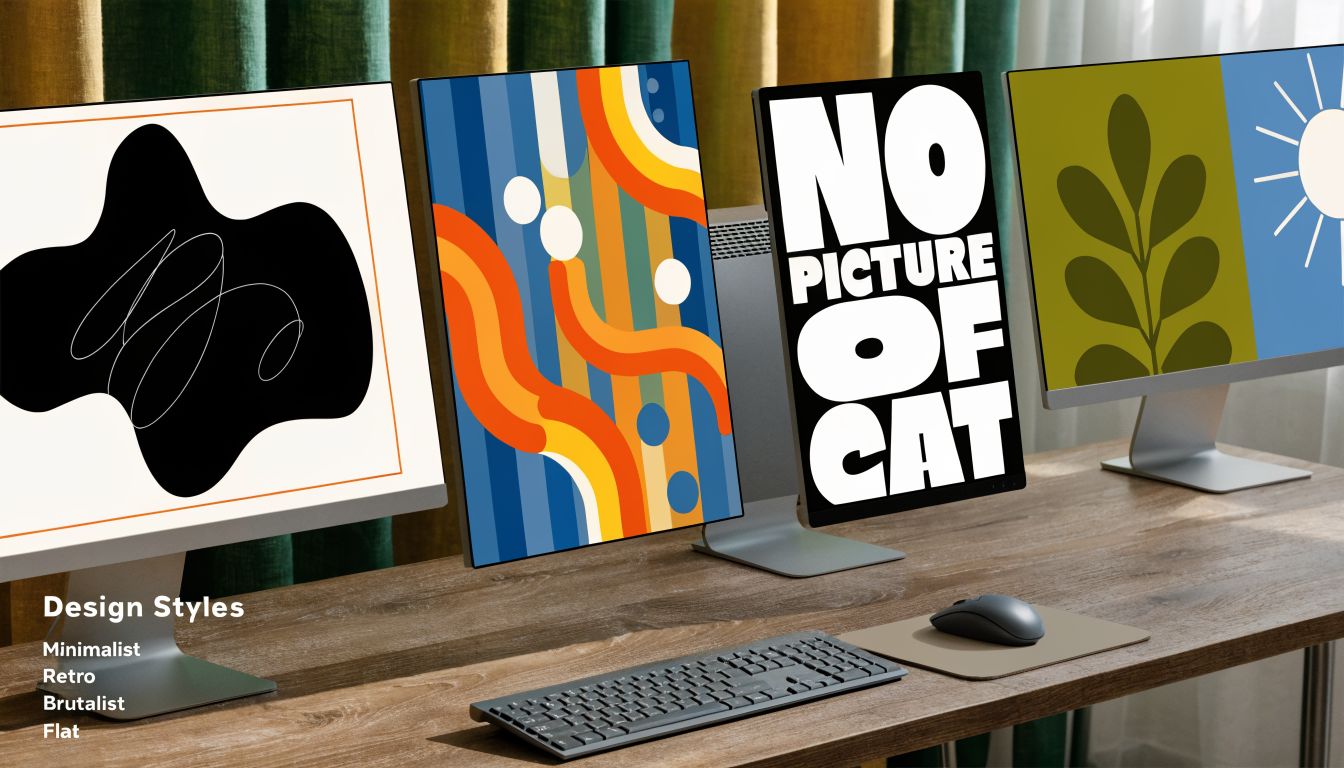
Minimalism is the art of saying more with less. It uses space generously, keeps colour palettes restrained, and avoids visual clutter.
Picture a modern art gallery. White walls. Good lighting. Nothing fighting for attention. That’s the feeling minimalism aims for.
It usually includes:
- Simple layouts with plenty of breathing room
- Limited colours that keep attention on the key message
- Clear typography rather than decorative type
- Few visual effects so content carries the weight
For business use, minimalism often works well for consultants, architects, wellness brands, software companies, and premium services. It can signal confidence because it doesn’t need to shout.
The risk is that some minimalist sites become so stripped back they lose personality. Clean isn’t the same as bland.
Brutalism
Brutalism is the opposite of polished softness. It’s bold, raw, and intentionally a bit confrontational.
Think of an industrial warehouse with exposed concrete, black steel, oversized signage, and no attempt to make things look delicate. On a website, that can mean heavy typography, stark colour contrast, sharp edges, and layouts that feel almost anti-pretty.
Brutalism can work for:
- Creative studios
- Fashion labels
- Music brands
- Youth-focused campaigns
- Businesses that want to look unconventional
It can be memorable, but it’s not a safe default. For many mainstream businesses, pure brutalism can make a site feel harder to trust or use if it isn’t handled carefully.
Flat Design
Flat Design became dominant in digital interfaces for a practical reason. It removes fake depth, textures, and decorative effects, then focuses on simple 2D shapes, clear icons, and strong contrast. According to the Kittl design styles reference, flat design’s 2D elements reduce file sizes by 40-60% compared with skeuomorphic design and directly cause 25% faster page rendering on iOS and Android devices in Australia.
For a small business, that means flat design isn’t just tidy. It can support speed.
Typical signs of flat design include:
| Feature | What it looks like | Why it helps |
|---|---|---|
| 2D icons and shapes | Clean symbols and blocks of colour | Easy to scan quickly |
| Sans-serif fonts | Clear, modern letterforms | Better readability on screens |
| Minimal effects | No heavy shadows or textures | Lighter pages and less visual noise |
| Bold contrast | Strong separation between text and background | Stronger usability on mobile |
Flat design is often a solid choice for service businesses, online stores, and software products because it balances professionalism and performance.
Material Design
Material Design is like flat design with a little more depth and guidance. It still feels modern and clean, but it uses subtle layering, cards, and movement to show what’s clickable and what belongs together.
If flat design is a printed map, Material Design is a map with clear signposts and tabs. It adds just enough dimensionality to guide the eye.
This style often suits:
- App-based businesses
- SaaS products
- Service platforms
- Booking systems
- E-commerce interfaces
It’s especially useful when a website has lots of moving parts, such as product categories, dashboards, or account areas.
After reading about visual categories, some owners want to generate rough concepts quickly before moving into a proper brief. If you’re exploring directions for illustrations or mock visuals, tools for unrestricted AI image generation can be useful for early inspiration. They’re not a replacement for strategy, but they can help you compare moods and references before a designer builds the final system.
Retro and vintage
Retro and vintage styles borrow visual cues from earlier decades. That might mean old-school typography, faded colours, badges, grain, hand-drawn details, or packaging-inspired layouts.
This style works when nostalgia is part of the brand. A brewery, barber, record store, diner, handmade goods brand, or boutique food business may benefit from it. It can feel warm, familiar, and distinctive.
The common mistake is going too literal. If every element looks like it came from an old poster, the site can become harder to use. The stronger approach is usually vintage flavour with modern usability.
Illustrative design
Illustrative design uses custom drawings, icons, characters, or scenes as a central brand element. It can feel friendly, creative, personal, or playful.
This can be a strong fit for:
- Child-focused brands such as tutoring or early learning
- Creative businesses that need a more human tone
- Explainer-heavy services where custom visuals simplify ideas
- Startups that want to avoid generic stock photography
Illustration can help a brand feel original, but it needs discipline. If every page uses a different style of artwork, the site loses consistency fast.
A quick visual explainer helps here:
Typographic design
Some brands build their whole look around type. Instead of relying on lots of imagery, they use bold headlines, careful spacing, and strong hierarchy to create impact.
Picture a shopfront with fantastic signage and restrained interiors. The words themselves become the design.
Typographic styles can be excellent for businesses that want to project authority, editorial polish, or premium confidence. Legal, strategy, architecture, publishing, and consulting brands often benefit from this approach.
A good typographic website doesn’t have “less design”. The typography is the design.
Which style is most practical for SMBs
Most Australian SMBs don’t need a pure version of any one style. They need a blend.
A local accountant may borrow from minimalism and flat design. A boutique retailer might combine illustration with retro accents. A startup may use a modern grid system with selective glass-like effects. The point isn’t to fit neatly into a museum label. The point is to choose a style direction that supports your brand and the way customers use your site.
How to Match a Design Style to Your Brand
Choosing among graphic design styles gets easier when you stop asking, “What do I like?” and start asking, “What should my customer feel and do?”
Personal taste matters, but it shouldn’t lead the process. A style that appeals to you as a founder might be the wrong fit for your market. That happens often when business owners copy brands from overseas, or from a completely different sector, because the design looks impressive in isolation.
Start with brand personality
Your design style needs to support the personality of the business. Not the personality you wish you had. The one your customers need to experience.
A practical way to define that is to choose a few traits from this kind of list:
- Stable and trustworthy
- Warm and community-focused
- Premium and refined
- Cutting-edge and forward-looking
- Bold and disruptive
- Handmade and personal
A financial planner usually benefits from very different visual signals than a youth streetwear label. If the style sends mixed messages, trust drops.
Then look at the customer, not just the brand
The importance of localisation is highlighted by a 2025 AGDA survey, which found that 68% of Australian designers noted poor localisation in style applications, leading to 42% lower engagement rates for non-adapted designs in local markets, according to the Looka graphic design styles reference.
That’s a strong reminder that style has to suit the audience’s context.
A Brisbane wellness studio might lean into soft minimalism with natural colours. A regional trade service may need something more direct, high-contrast, and no-fuss. A Perth legal firm may want a polished, restrained look with clear typography and strong hierarchy. They’re all “professional”, but they shouldn’t all look the same.
A simple matching framework
Use this checklist when narrowing down style options:
| Question | If your answer leans this way | Styles often worth considering |
|---|---|---|
| How should customers describe you | Reliable, organised, expert | Minimalist, typographic, flat |
| Do you need to feel innovative | New, digital, efficient | Minimalist, material, selective glass effects |
| Is personality a sales driver | Friendly, quirky, creative | Illustrative, retro, expressive typography |
| Do you want to challenge the market | Different, edgy, outspoken | Brutalism, experimental hybrids |
Build from a proper brief
A lot of bad design choices happen because the business never wrote down what the brand needs to communicate. That’s why a clear design brief definition matters. It forces decisions about audience, goals, constraints, competitors, and visual direction before anyone starts picking fonts and colours.
If you can’t explain why a style fits your brand in plain English, you probably aren’t ready to commit to it yet.
Avoid the common mismatch problems
Business owners usually get caught by one of these:
- Following trends blindly. A style looks current now, but doesn’t fit the business or age well.
- Designing for themselves. The founder loves dark edgy layouts, but the customer wants clarity and reassurance.
- Copying competitors too closely. The site ends up blending in instead of standing apart.
- Ignoring local signals. Imagery, colours, and tone feel imported rather than relevant to Australian buyers.
The best fit often comes from adaptation, not imitation. You can borrow the bones of a global style and still make it feel local through colour choices, imagery, language, and tone.
Translating Styles into Excellent Website UI and UX
A graphic design style can look brilliant in a mood board and still fail on a real website. That’s the gap between appearance and experience.
UI is the interface people interact with. UX is how that experience feels as they move through the site. Style affects both. It changes what stands out, what feels clickable, how easy pages are to scan, and whether people stay calm or get lost.
Good-looking isn’t always easy to use
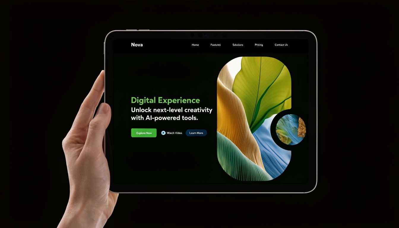
Minimalist and flat styles often support strong UX because they reduce distraction. Navigation labels are clearer. Buttons are easier to spot. Content hierarchy is easier to follow.
More experimental styles can still work, but they need more discipline. Brutalist layouts, heavy visual layering, or overly artistic typography may create strong brand impact while also making forms, menus, or calls to action harder to use.
That doesn’t mean bold styles are bad. It means they need to earn their complexity.
Accessibility has to be part of the style choice
This part gets overlooked far too often.
According to the Page Flows modern graphic design reference, AI adoption surged 52% among Brisbane agencies for styles like glassmorphism, but 61% of surveyed e-commerce sites failed WCAG audits because of issues such as low legibility. The same source also notes that 8% of Australian males are colour-blind. If your chosen style relies on faint contrast, translucent overlays, or colour alone to communicate meaning, some users will struggle.
That’s why accessibility isn’t a later technical fix. It’s part of the design decision itself.
What style means in practical UX terms
Here’s how style choices show up in everyday website behaviour:
- Typography choices affect whether service pages are easy to skim on mobile.
- Colour contrast affects readability in bright outdoor light.
- Spacing and layout affect whether users can find the next step quickly.
- Visual effects affect legibility and page clarity.
- Image treatment affects trust, especially when stock photos feel generic or mismatched.
For a broader view of how those decisions affect usability, this guide to user experience design principles is a useful companion.
A sensible way to implement style
A strong website usually follows a simple pattern:
- Choose a style direction that matches the brand
- Test it against mobile behaviour first
- Check readability before decoration
- Use visual effects sparingly
- Keep navigation conventions familiar
That last point matters. Users don’t want to solve a puzzle just to contact you.
A style should make your brand clearer. It shouldn’t make your interface harder to understand.
If you want soft translucent panels, heavy textures, unusual type, or experimental layouts, that’s fine. Just apply them where they add character, not where they get in the way. Hero areas, banners, and brand illustrations are safer places for experimentation than pricing tables, forms, and checkout screens.
Sector-Specific Style Recommendations for Australian SMBs
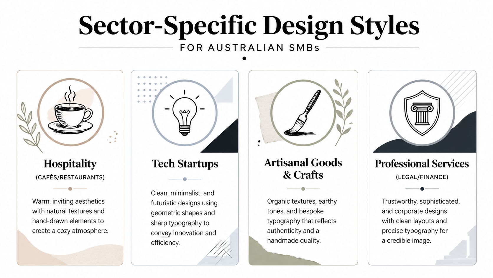
A Brisbane plumber, a Perth bookkeeper, and a Gold Coast café can all sell great work and still need very different websites. Their customers arrive with different expectations, different levels of urgency, and different reasons to trust or leave. Graphic design style works a lot like shop fit-out or staff uniform. It signals what kind of business you are before a visitor reads a full sentence.
That is why copying a global trend rarely works on its own. Australian small businesses need a style that fits their sector, their local audience, and the way people use the site on mobile, often in bright light, on patchy connections, or while comparing several providers at once. It also needs to support readable text, clear contrast, and practical accessibility choices that align with Australian expectations.
Trades and construction
Trades businesses usually win trust fast or lose it fast. A visitor wants to confirm three things within seconds. What do you do, where do you work, and can you be relied on to show up?
A rugged minimalist style often suits this category. Use bold headings, high-contrast colours, plain-language service labels, and real job-site photography from Brisbane, Logan, Ipswich, or wherever you operate. That local proof matters more than polished visual effects.
Some businesses can borrow a little from brutalism too. Thick lines, strong blocks of colour, and firm typography can feel solid and dependable. The key is restraint. If the design feels harsh or cluttered, quote requests drop because people cannot find the next step quickly.
Professional services
Law firms, accountants, mortgage brokers, and consultants usually benefit from a style that feels ordered and calm. Clients are often making a careful decision, not an impulsive one.
Modernist and typography-led styles work well here because they put structure first. Clean grids, restrained colour palettes, consistent spacing, and readable body text help complex information feel easier to absorb. That improves user confidence, especially on service pages that explain fees, process, or compliance.
This sector also needs accessibility handled properly. Small grey text on white might look refined in a mock-up, but it can become hard to read for older users or anyone on a bright phone screen outside.
Hospitality and lifestyle brands
Cafés, salons, fitness studios, boutique retailers, and restaurants sell experience as much as function. Here, the style can carry more personality because customers are often asking, "Does this place feel like me?"
Warm photography, softer colour palettes, hand-drawn details, and selective retro influences can all work well. The comparison is fashion. A hospitality brand can wear more character than an accounting firm, but the outfit still has to fit. If your menu, booking button, trading hours, or location are hard to find, the style is working against the business.
For Australian venues, local cues help. Photography that reflects the authentic suburb, authentic lighting, and authentic customers usually builds more trust than generic overseas stock images.
E-commerce retail
Online retail has less room for stylistic mistakes because every visual choice affects product discovery and checkout. A style may look distinctive on the home page, then create friction once shoppers start filtering products or adding items to cart.
Flat and material-inspired systems are often a strong base. They keep category pages, product cards, filters, and checkout steps clear. Brand personality can then come through in colour, typography, packaging imagery, or illustration without interrupting the buying path.
If you’re planning growth, it’s worth reviewing broader strategies to scale your eCommerce business so the design direction supports catalog growth, repeat purchases, and conversion flow rather than just homepage aesthetics.
Tech startups
Tech companies often want to look current and efficient, but that goal can push them toward trends that age quickly. A cleaner minimalist style usually gives better long-term value, especially when paired with strong messaging, simple diagrams, and disciplined use of colour.
Glass effects, gradients, and AI-generated visuals can still have a place. Use them as accents, not as the whole interface. If contrast drops or headings become hard to scan, the site starts to feel vague instead of credible. For a startup trying to explain a new product or win investor confidence, that is a costly trade-off.
Health, allied health, and community services
Medical clinics, physios, psychologists, NDIS providers, and community organisations need clarity with warmth. People visiting these sites are often anxious, time-poor, or looking for reassurance.
A softer modern style usually works well here. Clear headings, gentle colour choices, inclusive photography, and predictable page structure help visitors feel looked after. Accessibility matters even more in this sector. Forms, contact details, and service explanations should be easy to read, easy to tap, and easy to understand.
For businesses wanting support with the actual build, Website Builder Australia provides custom websites, ecommerce builds, graphic design, hosting, and related digital services for Australian businesses.
The best sector fit usually comes from starting with customer expectations in your market, then adapting a style to support trust, usability, and conversion. A design trend can be imported from anywhere. A website that works for Australian customers needs to feel right for the people you serve.
Choosing a Style That Works for Your Business
The right graphic design style isn’t the one that looks trendiest on a mood board. It’s the one that helps your business communicate clearly, feel trustworthy, and convert the right visitors.
If you remember only a few things, make them these. Style is strategy, not decoration. The strongest styles are built on solid foundations such as structure, readability, and purpose. And the best results usually come from adapting a style to your market, not copying one exactly as you found it.
For Australian SMBs, that means thinking locally as well as visually. Consider who your customers are, how they use your site, what they need to feel, and what action you want them to take. Then choose a style that supports that journey on desktop, on mobile, and under real-world conditions.
A good website doesn’t just look like your brand. It behaves like a helpful part of your business.
If you’d like help turning these ideas into a practical website direction, Website Builder Australia can help with design, development, ecommerce, hosting, and digital marketing for Australian businesses that want a site built around real business goals.


