
What Is Responsive Web Design and How It Actually Works
At its core, responsive web design means your website looks and works perfectly on any device imaginable. From a huge desktop monitor right down to the smallest smartphone screen, it’s all about creating one single site that automatically adjusts its layout to fit, ensuring every visitor has a great experience.
Understanding Responsive Web Design in Simple Terms
Think of your website as being like water. Pour it into a wide glass, and it fills the space. Pour it into a narrow vase, and it adapts perfectly. That's the simple idea behind responsive web design (RWD). It’s not about building different websites for different devices; it’s about creating one smart, flexible site that works beautifully on them all.

This fluid approach isn’t just a nice-to-have anymore—it’s an absolute must for any Aussie business with an online presence. With more and more Australians using their phones to find businesses, a non-responsive site is a serious roadblock. If your visitors have to constantly pinch, zoom, and scroll sideways just to read what you've written, they won't stick around.
Why Responsiveness Is Non-Negotiable Today
Let's be blunt: a poor mobile experience directly hurts your bottom line. It creates unnecessary friction for potential customers, making it a hassle for them to learn about your services or buy from you. In today's market, that friction can be the difference between a sale and a lost opportunity.
The numbers across Australia tell a very clear story.
- More than 60% of all website traffic now comes from mobile devices.
- Google's mobile-first indexing means your site's mobile version is the one that really counts for your search ranking.
- When a website fails to adapt, a staggering 57% of Australian users will simply leave and never come back.
A non-responsive website doesn't just look dated; it actively tells more than half of your potential customers that their experience doesn't matter.
Before we dive into a direct comparison, it’s worth noting the key difference between older, fixed-width websites and modern responsive ones. A non-responsive site is built for a single screen size—typically a desktop—and looks broken on anything else. A responsive site is designed to be flexible from the ground up.
Responsive vs Non-Responsive At a Glance
This table breaks down the critical differences for any Australian business owner weighing their options.
| Feature | Responsive Website | Non-Responsive Website |
|---|---|---|
| User Experience | Excellent on all devices (desktop, tablet, mobile). | Good on desktop only. Poor on mobile, requiring pinching and zooming. |
| SEO Performance | Favoured by Google's mobile-first indexing, leading to better ranks. | Penalised in search rankings due to poor mobile usability. |
| Maintenance | Manage one website with a single set of content and code. | Requires separate mobile and desktop sites, doubling the work. |
| Future-Proofing | Adapts easily to new screen sizes and devices as they emerge. | Becomes obsolete quickly as technology changes. |
| Conversion Rate | Higher, as it provides a smooth path to purchase on any device. | Lower, as mobile users abandon the site due to frustration. |
As you can see, the choice is pretty clear. Investing in responsiveness is investing in a better user experience, stronger SEO, and ultimately, more business.
The Team Behind the Technology
Bringing this seamless experience to life requires a specific mix of skills. To get a better handle on how it all works, it helps to understand the difference between a web developer vs web designer. While a designer is the architect who plans the user experience and visual layout for every screen, the developer is the builder who writes the code that makes that fluid vision a reality.
Ultimately, RWD is about putting your customer first, no matter how they choose to browse your site. It ensures your business looks professional, is easy to access, and is ready to engage with customers on any platform, setting a solid foundation for growth.
The Three Pillars of Responsive Design
So, how does a website magically reshape itself for any screen? It’s not magic, but a clever combination of three core technical principles. Understanding these pillars helps you appreciate the craftsmanship behind a truly professional responsive website, even if you never touch a line of code.
Think of them as the foundational building blocks that allow a single website to provide a seamless experience everywhere.

These three elements work in harmony. As a screen shrinks or expands, the content on the page responds gracefully, always prioritising readability and usability for your visitor.
Pillar 1: Fluid Grids
First up is the fluid grid. Imagine your website's layout is like a flexible shelving unit. On a wide wall (a desktop monitor), the shelves can spread out to fill the space. But on a narrow wall (a smartphone screen), those same shelves contract and stack vertically to fit perfectly.
A fluid grid works the same way. Instead of using fixed, rigid measurements like pixels, it uses relative units like percentages. A column might be set to take up 50% of the screen width, not 600 pixels. This means that whether the screen is 1600 pixels wide or 400 pixels wide, that column will always occupy half of the available space.
This is the bedrock concept that allows all your page elements—from text blocks to contact forms—to scale proportionally, maintaining their intended layout across every device.
Pillar 2: Flexible Images
Next, we have flexible images. If you’ve ever tried to stretch a regular photo, you know it becomes a distorted, pixelated mess. Flexible images in responsive design are built to avoid this, behaving more like a rubber band that can stretch or shrink without breaking.
This is achieved with a simple but powerful bit of code that tells images to never exceed the width of their container. By setting a maximum width of 100%, an image automatically resizes to fit snugly within its column on the fluid grid.
This ensures your visuals always look sharp and correctly scaled. A large, beautiful banner on a desktop will shrink down to fit a mobile screen, without overflowing the page, causing awkward horizontal scrolling, or slowing down your load time.
A responsive website treats its content like liquid, pouring it into the shape of whatever container (or screen) holds it. Fluid grids create the container, flexible images ensure visuals fit, and media queries act as the intelligent director telling everything where to go.
Pillar 3: Media Queries
The final and most crucial pillar is media queries. If fluid grids and flexible images are the building materials, media queries are the brain of the whole operation. They are simple filters in your site's code that detect the characteristics of the device being used—most importantly, its screen width.
Based on what it detects, a media query applies a specific set of style rules. For example, a media query might say:
- "If the screen is wider than 1024 pixels": Display the navigation menu horizontally across the top of the page.
- "If the screen is narrower than 768 pixels": Hide that horizontal menu and show a compact 'hamburger' menu icon instead.
- "If the screen is narrower than 480 pixels": Increase the font size for better readability and make all the buttons larger for easier tapping.
These conditional rules are what make significant layout changes possible. It ensures the design isn’t just a shrunken-down version of the desktop site, but an experience truly optimised for mobile. Together, these three pillars form the backbone of modern responsive web design.
Business Benefits of a Responsive Website
It’s one thing to get your head around the technical side of responsive web design, but what really matters is how it actually helps your business. Investing in a responsive website isn't just about keeping up with modern aesthetics; it's a fundamental business decision that directly impacts your bottom line.
From bringing more customers through the digital door to making your own life easier, the benefits are clear, measurable, and essential for any Australian business looking to grow. Think of it as your hardest-working employee—one that makes a brilliant first impression on every single visitor, no matter how they find you.
Boost Your Visibility on Google
Let’s be honest, search engine optimisation (SEO) is the lifeblood of most businesses online. And when it comes to SEO, Google has made its position crystal clear with mobile-first indexing. In simple terms, this means Google now predominantly uses the mobile version of your website to rank it.
If your site is a mess on a smartphone, your search rankings are going to take a hit across the board—even for people searching on a desktop. A responsive website is built to be mobile-friendly from the ground up, sending all the right signals to search engines. This single, adaptable site makes it far easier for Google to crawl and understand your content, which is a massive tick in the box for climbing the search rankings and pulling in more organic traffic.
Increase Conversions and Generate More Leads
A smooth, easy-to-use website experience is directly tied to your conversion rate. It just makes sense. When a potential customer lands on your site from their phone and can effortlessly browse your services, read your blog, or fill out a contact form, you’ve removed all the friction.
Compare that to a clunky, non-responsive site that forces people to pinch and zoom just to read a sentence. That frustration sends them straight to your competitor. A well-designed responsive website isn't just about looking good; it's about making it dead simple for people to do business with you.
The numbers don't lie. For Australian businesses, the case for responsive design becomes undeniable when you look at conversion data. Websites that implement a personalised, responsive design have seen conversion rates jump by as much as 202% compared to those using generic templates. It’s solid proof that putting the user first pays off.
Create a Better and More Accessible Experience
Beyond just making sales, a responsive website builds trust. It shows you actually care about every user's experience, and that includes accessibility, which is no longer a 'nice-to-have' but a business necessity. Research shows that a staggering 69% of users will simply give up and leave a website if it doesn't meet their accessibility needs.
A thoughtfully built responsive site naturally incorporates features like readable text, large buttons that are easy to tap, and better compatibility with screen readers. Getting this right means you’re not accidentally shutting the door on a huge portion of your potential audience.
Reduce Costs and Streamline Maintenance
Before responsive design became the standard, many businesses were stuck building and paying for two separate websites: a full version for desktops and another, often stripped-down, version for mobile. This was not only expensive but a complete nightmare to keep updated.
With a single responsive website, all that duplication is gone. You have one set of content to manage, one marketing strategy to execute, and one site to maintain. This consolidation saves a massive amount of time and money, freeing up your budget and energy to focus on what you do best—running your business. You can dive deeper into how a great site delivers value in our articles on small business website benefits.
Responsive vs Adaptive and Mobile-First Design
While responsive web design is the industry standard these days, it’s not the only game in town. Two other terms you’ll often hear are adaptive design and mobile-first design.
Getting your head around the differences isn’t just for tech-heads. It helps you have much clearer conversations with developers and make smarter calls for your business’s future online.
As we've covered, responsive design is built on a single, fluid layout. Think of it like a one-size-fits-all t-shirt made from a high-tech, stretchy fabric that perfectly fits whoever wears it. It’s one design and one set of code that offers almost infinite flexibility.
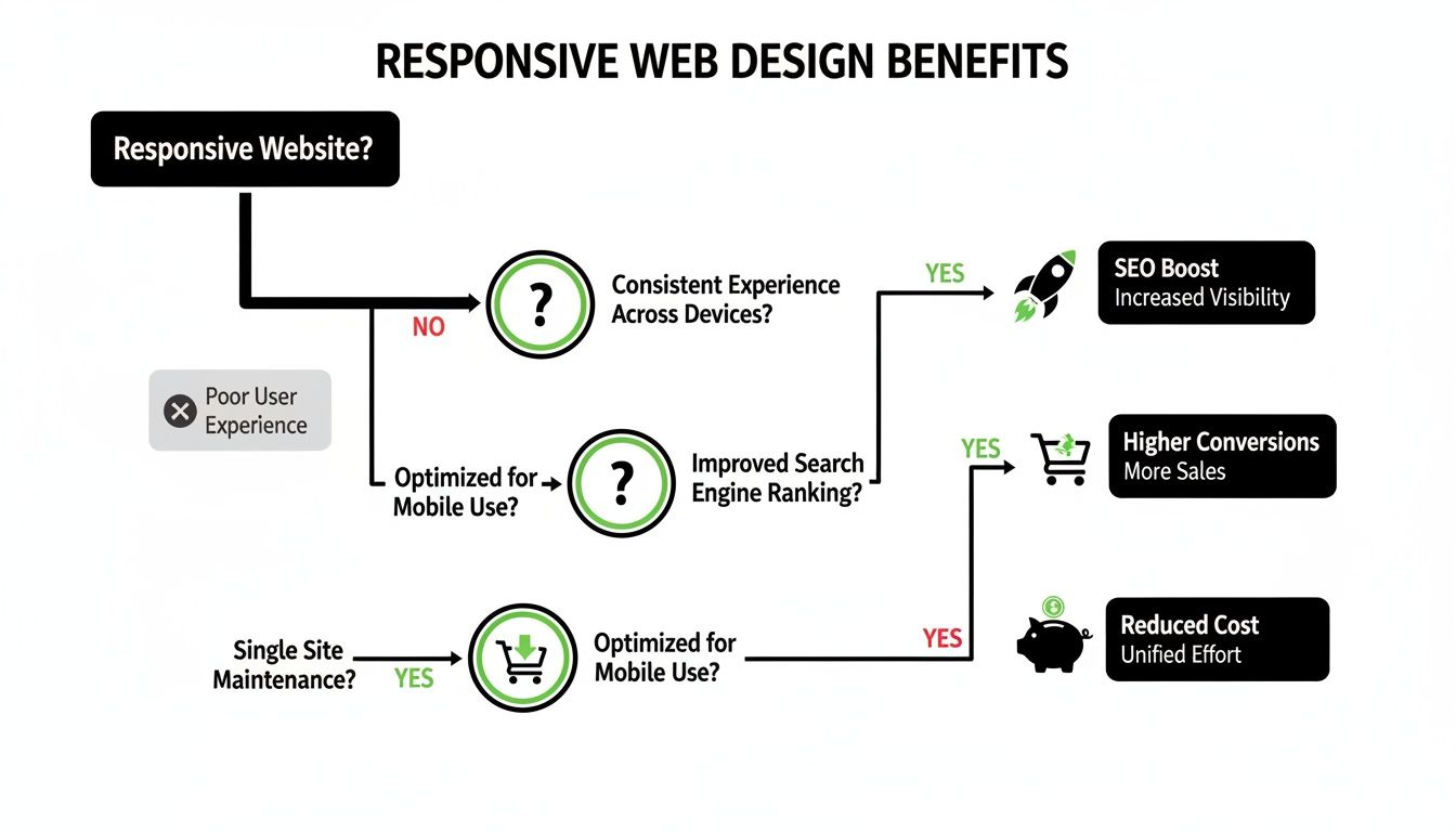
This flowchart really drives home the business case. A responsive site is the foundation, and from it, you get tangible benefits like better SEO, higher conversions, and lower maintenance costs.
Understanding Adaptive Design
Adaptive web design takes a completely different path. Instead of one fluid layout, developers create several distinct, fixed layouts designed for specific screen sizes—think one for mobile, one for tablet, and one for desktop.
When you visit an adaptive site, the server figures out what device you're on and sends back the pre-built layout that fits best.
It's like offering t-shirts in set sizes: small, medium, and large. You get the size that's closest to a perfect fit, but it's not made of that magic stretchy material.
Adaptive design is like having different tailored outfits for different occasions (devices), whereas responsive design is one versatile suit that looks great no matter where you wear it.
The upside? Adaptive can sometimes deliver faster load times on mobile because it only loads the assets needed for that specific version. The downside is it demands more work upfront to build all those separate layouts, and it can look a bit awkward on any screen size that falls between the preset designs.
The Mobile-First Philosophy
Finally, there's mobile-first design. This isn't really an alternative but more of a strategic philosophy that can be applied to either a responsive or an adaptive build.
It completely flips the traditional design process on its head.
Instead of designing for a massive desktop screen and then figuring out how to cram it all onto a phone, you start with the smallest screen first. This forces you to be ruthless with prioritisation, focusing only on the absolute essential content and features.
Once that core mobile experience is nailed, you progressively enhance the design for larger screens, adding in more complex features and layout elements as you get more space to play with.
Starting with mobile constraints almost guarantees a leaner, faster, and more user-friendly site for the majority of people who will visit it. For a deeper dive, you can explore more about mobile-first design and see why it’s become so important.
Comparing Web Design Approaches
To make it easier to see the differences at a glance, we've broken down the core concepts and best use cases for each approach.
| Approach | Core Concept | Best For |
|---|---|---|
| Responsive | A single, fluid layout that automatically adjusts to any screen size. | Most businesses needing a versatile, future-proof, and SEO-friendly website. |
| Adaptive | Multiple fixed layouts designed for specific device sizes. The server delivers the correct one. | Complex web applications where a tailored experience and speed on specific devices are critical. |
| Mobile-First | A design strategy that starts with the smallest screen and expands upwards. | Any modern web project. It ensures the mobile experience is prioritised, not an afterthought. |
Each strategy has its place. But for most Australian businesses, a mobile-first approach applied to a responsive design offers the best balance of flexibility, user experience, and cost-effectiveness. It's the winning combination for the modern web.
Right, so a website that looks good on any screen is a great start, but it's only half the story. A truly responsive site goes much deeper. To deliver an experience that actually impresses users and keeps them coming back, we need to focus on two things that can make or break your online success: performance and accessibility.
A site that adapts its layout but takes forever to load or can't be used by everyone isn't just failing its visitors—it's failing the business.
Real responsive design is about the user's entire journey. That means thinking about how quickly they can get to your content and how easily they can interact with it, no matter what device they're on or what their personal abilities are.
The Need for Speed in a Mobile World
When someone's on their phone, every single second counts. They're often on the move, maybe with a spotty connection, and their patience is a lot thinner than someone sitting at a desktop. A slow-loading site is probably the fastest way to lose a customer for good.
This is especially true here in Australia, where we live on our phones. With over 90% of Sydney residents using a smartphone as their primary way to find local businesses, the expectation for speed is through the roof.
Studies have shown that a staggering 53% of mobile users will ditch a site if it takes longer than three seconds to load. Even a one-second delay can drop your conversions by 7%. And now that Google bases its rankings entirely on the mobile version of your site, speed isn't just a nice-to-have; it's a fundamental part of SEO.
To get that speed, developers concentrate on a few key technical fixes:
- Optimising Images: Shrinking image file sizes without making them look pixelated is crucial for fast loading times on mobile networks.
- Minifying Code: This is like a spring clean for your website's code (HTML, CSS, JavaScript). It removes all the unnecessary characters and spaces to make the files smaller and quicker to download.
- Leveraging Caching: This technique stores parts of your site in a user's browser. When they visit again, the site doesn't have to load everything from scratch, which makes it feel much faster.
Nailing these details helps a responsive site deliver the slick, instant experience that mobile users now expect. You can dive deeper into this topic in our articles on website performance.
Designing for Everyone with Accessibility
The other side of the coin for a brilliant user experience is accessibility. An accessible website is simply one that everyone can use. This includes people with disabilities who might use tools like screen readers or navigate with a keyboard instead of a mouse.
True responsive design is inclusive design. It ensures that your message and services are open to the widest possible audience, reflecting a commitment to all customers.
Accessibility isn’t some niche add-on; it's just good design practice. For developers wanting to get their typography just right, a REM converter tool can be handy for creating text that scales properly for all users.
Making a responsive site accessible involves practical steps that actually end up helping every single visitor:
- Thumb-Friendly Buttons: All buttons and links need to be big enough—and have enough space around them—to be tapped easily on a small screen. No more fat-fingering!
- Readable Text: Using clear fonts with good colour contrast between the text and background makes your content easy to read for everyone, especially those with visual impairments.
- Logical Navigation: The site needs to be structured so you can get around using just a keyboard. This is essential for users who can't operate a mouse.
- Descriptive Links: Link text should clearly say where it's going (e.g., "View our pricing plans" instead of "Click here"). This is a win for both SEO and for screen reader users.
When you put it all together, a responsive website that is both fast and accessible creates a welcoming space for every visitor. It breaks down barriers, builds trust, and shows that your business is truly open for everyone.
Alright, let's get your website looking sharp on every screen.
Knowing the theory behind responsive web design is one thing, but seeing how your own site measures up is where the rubber meets the road. This checklist is a quick, no-tech-degree-required way to audit your website's health.
Think of it as a guided tour of your website through the eyes of a mobile visitor. So, grab your smartphone, pull up your site, and let's have a proper look. Answering these simple questions will give you a crystal-clear picture of what's working and where things could be a whole lot better.
User Experience Audit
The first impression on a small screen is everything. A clunky, frustrating experience will have potential customers bouncing faster than you can say "G'day".
- Is navigation intuitive? Can you find the main menu without a treasure map? Getting to key pages like 'Services' or 'Contact Us' should be dead simple. If your desktop menu is just squashed onto the mobile screen, that's a classic sign of trouble.
- Are buttons and links easy to tap? Give a few call-to-action buttons and links a go. If you have to zoom in or you're accidentally hitting the wrong thing, they're too small or packed too tightly. This is a massive source of user frustration.
- Does the layout make sense? Your content should flow neatly in a single column. Nothing should be cut off, and you should never have to scroll horizontally to see text or images. Ever.
Technical Performance Check
A responsive site isn't just about looking good; it has to be quick on its feet, especially on mobile data which can be a bit dodgy compared to your home Wi-Fi.
A website that looks beautiful but takes ten seconds to load on a mobile device is fundamentally broken. Performance is a core component of a successful responsive experience.
- How fast does it load? Switch off your Wi-Fi and test your site on your mobile network. Does it pop up in a few seconds, or are you left staring at a blank screen? Slow load times are the number one reason people give up and leave.
- Are images optimised? Have a look at the photos and graphics on your site. Do they look crisp and clear without making the page drag its feet? Huge, unoptimised images are one of the biggest culprits behind a sluggish mobile site.
Content Readability Review
At the end of the day, your website is there to communicate. If your visitors can't easily read what you've written or use your forms, your entire message is lost.
- Can you read the text easily? You should be able to read everything on the page comfortably, without pinching to zoom. If the font is tiny, your site is failing a basic accessibility test.
- Are forms simple to complete? Head over to your contact or enquiry form. Are the fields big enough to tap into and start typing? Is filling it out and hitting 'submit' straightforward? Overly complicated forms are a massive roadblock for generating new leads.
Common Questions About Responsive Web Design
Getting into the nitty-gritty of responsive web design often brings up a few questions, especially when you’re trying to make the smartest call for your business. Let's tackle some of the most common queries we hear from Aussie business owners.
How Much Does a Responsive Website Cost in Australia?
There's no single price tag here—it really depends on how complex the job is. For a local service business needing a straightforward, informative website, you might be looking at a starting point of a few thousand dollars. But if you’re building a sophisticated e-commerce site with custom features and payment gateways, that’s a whole different ball game and a much bigger investment.
The real key is to stop thinking of it as a cost and start seeing it as a core business investment. A properly built responsive website has a direct impact on your Google rankings, how customers feel when they use your site, and your ability to actually make sales. It’s the very foundation of your online presence and a non-negotiable tool for growth.
Can My Existing Website Be Made Responsive?
Sometimes, yes, but it’s often not the most practical or budget-friendly option. If your current site is a bit long in the tooth or built on old tech, trying to retrofit it can be more difficult and time-consuming than just starting over with a modern, responsive framework.
A complete redesign is also a golden opportunity to do more than just a tech update. It’s a chance to refresh your brand's look, restructure your site for better SEO, and map out a user journey that actually makes sense. An expert can take a look at what you’ve got and give you the straight-up advice on whether a patch-up job or a fresh build is the smarter long-term move.
For most businesses, investing in a new, properly constructed responsive site delivers a far greater return than patching an outdated one. You get a solid, future-proof foundation instead of a temporary fix.
How Do I Test if My Website Is Responsive?
Good news—you don't need to be a developer to figure this out. Here are a few dead-simple ways you can check right now.
- The Browser Resize Test: On your desktop, just open your website and grab the corner of your browser window. Drag it to make it narrower, then wider. A responsive site will fluidly reorganise itself, with content stacking neatly and images resizing on the fly. If things get cut off or a horizontal scrollbar appears, it's a fail.
- Google's Mobile-Friendly Test: Google offers a free tool where you can plug in your website’s address. It’ll run a quick analysis and tell you straight up if your site meets its mobile-friendly standards. This gives you a clear yes-or-no answer from the one search engine that truly matters.
- The Real-World Test: The most important test is also the most obvious. Just grab your phone and visit your own website. Try to navigate around, read some text, and tap on a few links. If you find yourself pinching and zooming to read anything or struggling to hit the right button, your site isn't delivering the responsive experience your customers expect.
Ready to make sure your website works flawlessly on every single device? The team at Website Builder Australia builds high-performance, custom responsive websites that help Australian businesses grow. Get in touch with us today for a no-obligation quote and let's build an online presence that gets results.
