

Best Ecommerce Website Design Guide for 2026
You might be in this position right now. Your store gets visits, people browse a few pages, some even add products to cart, but sales don't follow. The problem often isn't the product. It's that the site feels harder to trust, harder to find your way around, or harder to use than you realised.
For Australian businesses, that matters more than ever. Online shopping is already mainstream. Customers aren't judging your store against a local competitor down the road. They're comparing it with every polished online experience they've had this week. The best ecommerce website design isn't the prettiest layout. It's the one that helps people feel confident enough to buy.
Why Your Online Store's Design Is More Than Just a Look
A customer lands on your store from an Instagram ad while standing in line for coffee, or from a patchy mobile connection in regional Australia while comparing prices before dinner. They are not studying your typography like a designer. They are asking faster, simpler questions. Is this business legitimate? Can I find what I need quickly? Will payment and delivery feel straightforward?
That is why design affects revenue. It shapes first impressions, reduces doubt, and helps people keep moving toward purchase instead of dropping out halfway through.
Credibility is a big part of that. Stanford research found that 46.1% of people judge a website's credibility based on its overall visual design, including layout, typography, and structure, not just the logo or colour palette, as reported by the Stanford Web Credibility Project. For ecommerce, the effect continues further down the funnel. The Baymard Institute's checkout research shows that checkout friction remains one of the biggest reasons shoppers abandon a purchase.
For an Australian business, those design choices carry extra weight. Your store may need to reassure someone who expects to pay with a familiar option, check delivery timing to a suburb outside a capital city, and complete the order on a phone with slower data speeds. A polished site that ignores those realities can still underperform.
A good store design works like a well-run shop floor. Clear signs point people in the right direction. Pricing is easy to spot. Staff answer common questions before they turn into objections. Online, your layout, product pages, checkout flow, and delivery information do that job.
Here is what strong design does in practice:
- Builds trust quickly: Clean layouts, readable text, consistent branding, and visible contact details make the business feel established.
- Removes hesitation: Clear pricing, shipping expectations, returns information, and checkout cues answer questions before people leave to look elsewhere.
- Supports buying behaviour: Product organisation, filtering, search, and page hierarchy help customers reach the right item faster.
- Helps discovery beyond traditional search: If you're also thinking about improving AI search visibility for e-commerce, site structure and clear product information help systems interpret and surface your pages more accurately.
Many owners say they want a better-looking website. What they usually need is a store that feels easier to trust and easier to buy from, especially for Australian customers with local payment habits, delivery questions, and mixed mobile conditions. Focusing on conversion is the right goal.
The Foundations of Excellent Ecommerce User Experience
A strong ecommerce site works like a well-planned physical shop. If customers walk in and can't tell where things are, they won't stay long. Online, that confusion happens through menus, cluttered pages, weak search, and inconsistent layouts.
The fix isn't adding more design features. It's building better structure.
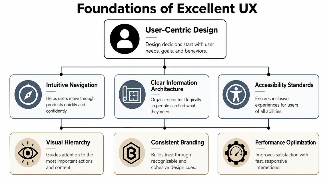
Start with information architecture
Information architecture is just the logic behind how your store is organised. Categories, sub-categories, menus, filters, breadcrumbs, and internal links all belong here.
If you sell skincare, don't force people to guess whether cleanser sits under "Face", "Beauty", or "Shop All". If you sell tools, don't bury drill accessories in a general hardware menu. Group products the way customers think, not the way your inventory spreadsheet is structured.
A simple test helps. Ask someone unfamiliar with your site to find one product in under a minute. Watch where they hesitate. That's where your architecture is failing.
Make navigation predictable
Customers don't want to learn your website. They want to use patterns they already know.
That usually means:
- A clear top menu: Keep primary categories obvious and limited to the main buying paths.
- Visible search: Search should be easy to spot on desktop and mobile.
- Useful breadcrumbs: These help people move back up a category tree without starting over.
- A stable cart and account area: Shoppers expect these in familiar positions.
If your menu tries to be clever, it usually becomes confusing. Plain labels outperform branded or quirky wording because buyers scan quickly.
For a practical refresher on layout and behaviour patterns, Figr's guide to user experience design principles is useful because it focuses on how users interpret interfaces, not just how designers style them.
Good UX often feels invisible. People don't praise it because nothing gets in their way.
Guide the eye with visual hierarchy
A customer shouldn't have to hunt for the next step. Every page needs a clear visual order.
Think of the page as a conversation:
- What is this page about?
- What matters most here?
- What should I do next?
That means your most important elements need the strongest emphasis. On a product page, that might be the product name, image, price, delivery information, and Add to Cart button. On a category page, it might be the filters, product grid, and sorting tools.
A quick comparison makes this easier to assess:
| Page element | Weak hierarchy | Strong hierarchy |
|---|---|---|
| Headline | Small, buried in clutter | Clear and easy to scan |
| CTA button | Same style as other links | High contrast and obvious |
| Product details | Dense text block | Broken into readable sections |
| Key policies | Hidden in footer only | Visible near decision points |
Keep branding consistent without letting it take over
Brand consistency matters because it reassures the customer they're still dealing with the same business from homepage to checkout. But consistency doesn't mean every part of the page should compete for attention.
Use the same type styles, colour system, image treatment, and button patterns across the site. Then let function lead. A good brand experience supports shopping. It doesn't interrupt it.
Don't forget accessibility and clarity
Accessibility isn't a side issue. It's part of usability.
Text needs contrast. Buttons need clear labels. Forms need to be easy to complete. Images need to support, not replace, meaning. If your site only works well for people with perfect vision, perfect dexterity, and plenty of time, it's not well designed.
The strongest ecommerce UX usually feels calm. Customers know where they are, what to do, and what happens next.
Designing Product and Checkout Pages That Convert
A customer lands on a product page from a Google search on their phone. They like what they see. Then they start looking for the details that decide whether the order happens. Is it in stock? How long will delivery take to regional NSW? Can they pay with PayPal, Afterpay, or card? If those answers are hard to find, the sale starts to wobble.
That is why product pages and checkout pages deserve more attention than almost any other part of your store. One builds confidence. The other protects it.
Treat search and filtering as part of the buying journey
Search and filters are not background features. They are the shop assistant for customers who already know roughly what they want.
That matters even more for Australian stores with broad catalogues, large delivery areas, or product ranges that need careful selection. A fashion retailer may need filters for size, fit, colour, fabric, and sale items. An auto parts supplier may need brand, model, year, and compatibility. A furniture store may need dimensions, material, room type, and delivery availability.
Good filtering reduces decision fatigue. It narrows a big shelf into a short list the customer can compare. Search does the same job for shoppers who arrive with a specific item in mind.
If you run on Shopify, image weight also affects how quickly product grids and filtered pages load. This guide on how to improve Shopify store speed is useful for reviewing image sizing decisions that can slow browsing.
Build product pages that answer questions in the right order
A strong product page works like a good salesperson in a store. It answers the obvious question first, then removes the doubts that stop someone from buying.
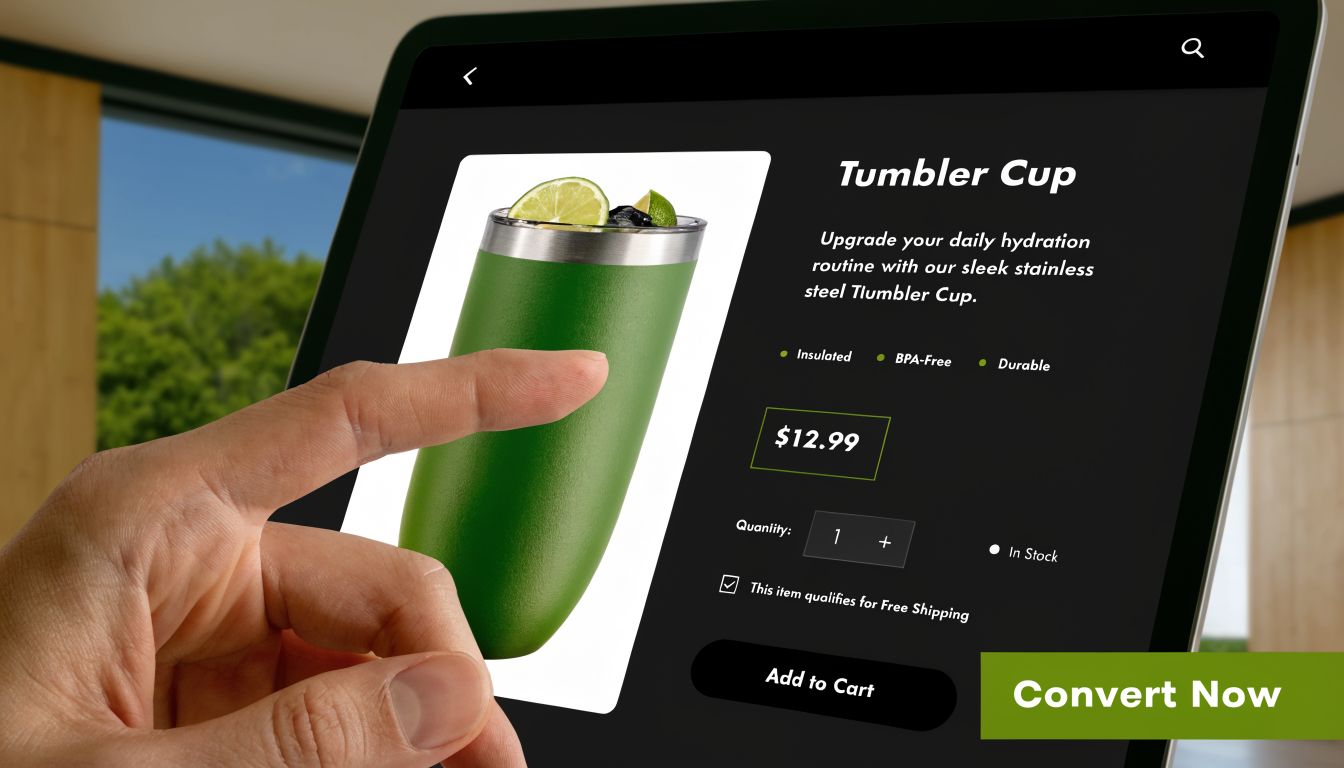
Start with the core decision details near the top of the page:
- Product name that is clear and specific
- Price that is visible immediately
- Images that show the product properly, not just artistically
- Options and variants that are easy to understand
- Stock status so customers know whether they can buy now
- Add to Cart button that stands out clearly
Then handle the practical questions that often decide the sale:
- sizing or dimensions
- materials or ingredients
- compatibility details
- care instructions
- returns policy
- shipping timeframes
- delivery costs or delivery estimator
This sequence matters. Customers need a quick read first, then proof, then reassurance. If every detail is hidden inside tabs or buried below oversized lifestyle imagery, the page looks polished but sells poorly.
Australian buyers often look for delivery clarity earlier than many store owners expect. If you ship from Melbourne but serve Perth, Darwin, and regional areas, generic wording like "fast shipping" is too vague. Give realistic delivery guidance close to the purchase area so the customer does not have to hunt for it.
Use product imagery to reduce hesitation
Images should help a customer inspect the product, not just admire the brand.
For many stores, that means a mix of plain product shots, close-ups, scale references, and real-world context. If you sell apparel, show fit from more than one angle. If you sell furniture, show dimensions in a room. If you sell tools or parts, show the exact connectors, finishes, or included components.
Clear images build trust because they lower the fear of getting the wrong item.
For stores reviewing image layouts across devices, these mobile web page design principles for Australian businesses are useful when deciding how galleries, buttons, and buying details should stack on smaller screens.
Make checkout feel calm, clear, and local
Checkout should feel like the final metre of a well-marked path. The customer should never wonder what happens next.
Strong checkout pages usually include:
A clear step sequence
Show whether the shopper is in cart, details, shipping, or payment.Simple form fields
Ask for what you need, label fields clearly, and make errors easy to fix.An always-visible order summary
Customers want to check items, quantities, shipping, and total before they pay.Upfront costs
Surprise shipping fees are one of the fastest ways to lose an order.Local payment confidence
Show the payment methods Australians expect, such as cards, PayPal, and buy now pay later options if they suit your market.Delivery reassurance
Give realistic dispatch and delivery guidance, especially if timing varies outside metro areas.
A checkout audit can be very simple:
| Customer concern | What your checkout should make clear |
|---|---|
| Am I ordering the right item? | Product name, variant, quantity, image |
| What is the final cost? | Item total, shipping, taxes if applicable, total |
| How will I pay? | Visible payment options before the final step |
| When will it arrive? | Dispatch timing and delivery estimate |
| Can I change something? | Easy cart edits and form correction |
Guest checkout also matters for conversion. Forced account creation adds work at the point where the customer wants less of it, not more.
The best product and checkout design feels straightforward because every question is answered at the moment it appears in the buyer's mind. That is what turns interest into completed orders.
Mastering Mobile Design and Blazing-Fast Performance
A customer in regional Queensland taps your ad on a lunch break. Your homepage takes too long to load on mobile data. The banner image stalls, the menu hesitates, and the product grid jumps as it appears. Before they even look at your range, the sale is already under pressure.
That is why mobile performance is part of design, not a separate technical job left for later.
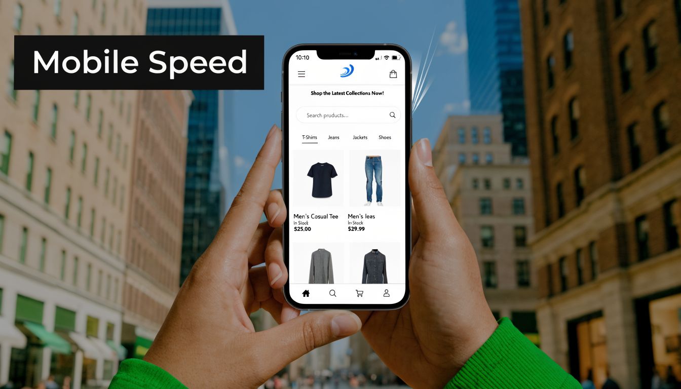
For many Australian stores, the phone is the main storefront. It is where people browse on the train, compare prices from the couch, and place orders between other tasks. If your site only feels polished on a large desktop screen and fast city connection, it is missing the conditions many real customers use every day.
Performance is part of the user experience
Store speed shapes first impressions in the same way shop layout shapes an in-person visit. If the front door sticks, the lights flicker, and the aisle signs are hard to read, people lose confidence quickly. Online, slow images, delayed buttons, and jerky page movement create the same effect.
Fast stores feel easier to trust. Search responds quickly. Product lists appear without lag. Filters feel stable. Pages stop shifting while someone is trying to tap. That keeps attention on the product instead of the interface.
This matters even more in Australia because connection quality is not consistent. A store that feels acceptable in inner Sydney can feel clumsy in outer suburbs, regional towns, or while a shopper moves between Wi-Fi and mobile data.
Design for the device in someone's hand
Mobile-first design starts with constraints. Smaller screens leave less room for distractions. Touch input needs larger targets. Mobile users are also less patient because they are often shopping in short bursts.
A good mobile layout usually has these traits:
- Clear visual hierarchy: The screen shows the next useful action first, not every option at once.
- Thumb-friendly tap targets: Buttons, filters, and menu items are easy to press without zooming.
- Readable content: Text sizes, spacing, and contrast support quick scanning on smaller screens.
- Stable page layouts: Content does not jump around as images or scripts finish loading.
- Focused pages: Decorative effects are used sparingly so products and actions stay prominent.
For businesses planning a redesign, practical examples from mobile web page design can help your team choose layouts that suit real phone behaviour, not desktop habits squeezed into a smaller frame.
Simplicity often performs better
Many ecommerce owners assume a better design needs more movement, more effects, and more apps. In practice, extra weight often works against sales.
A lighter store usually performs better because each page asks the browser to do less work. Fewer oversized images need downloading. Fewer scripts compete for attention. Fewer pop-ups interrupt the task the customer came to complete.
A practical performance checklist looks like this:
| Area | Better choice |
|---|---|
| Product images | Compress files and serve the right size for the screen |
| App stack | Remove tools that duplicate features or add heavy scripts |
| Fonts | Limit font families and weights so text appears faster |
| Layout | Use responsive sections that stay readable on small screens |
| Motion effects | Keep transitions subtle and avoid animations that slow interaction |
If you're running Shopify, this guide on how to improve Shopify store speed is a practical reference for image handling and page-weight decisions.
What mobile-first looks like in a store
Mobile-first design is task-first design. The customer should be able to find a category, compare products, and take the next step without hunting around the screen.
That usually leads to choices like these:
| Mobile element | What works better |
|---|---|
| Navigation | Short menu with clear top categories |
| Search | Visible search bar with useful suggestions |
| Product cards | Strong image, clear title, price, and obvious tap area |
| Filters | Simple controls that are easy to open, use, and close |
| Forms | Larger fields, fewer inputs, and keyboards matched to the field type |
A short explainer can help if your team needs to align on the basics before development begins.
Judge mobile quality by one standard. Can a customer on an ordinary phone, with an ordinary connection, browse and buy without delay or frustration? If the answer is yes, your design is doing its job.
Building Trust With Australian Payments and Shipping
A shopper in Sydney might expect next-day delivery. A shopper in regional Western Australia may expect to wait longer, but still wants a clear estimate before paying. If your store hides that information until late in checkout, trust drops fast.
For Australian businesses, trust is built through practical design choices that answer local buying questions early. Shoppers want to know whether they can use Afterpay, PayPal, Apple Pay, or a card they already trust. They want GST clarity. They want delivery estimates that reflect their postcode, not a vague promise that suits only metro customers.
Design trust into the buying journey
Payment and shipping details should appear before doubt has time to grow.
If your store offers Afterpay or PayPal, show those options on the product page and in the cart, not only on the final payment screen. That small choice tells customers your checkout will fit the way they already buy.
Shipping works the same way. A postcode estimator near the Add to Cart button helps customers judge whether the product will arrive in time and whether the delivery cost feels reasonable. For Australian stores, that matters even more because delivery expectations can change sharply between capital cities, outer suburbs, and regional areas.
Tax display also affects trust. If your prices include GST, say so near the price. If shipping is calculated later, explain that clearly. Surprises at the end of checkout feel like hidden costs, even when they are technically correct.
Remove doubt where it starts
Online trust works like clear signage in a physical shop. If people have to stop and ask basic questions, the buying flow has already weakened.
Common points of hesitation include:
- Payment uncertainty: "Can I pay with the option I prefer?"
- Delivery uncertainty: "How long will this take to reach my suburb or regional town?"
- Price uncertainty: "Is GST included in this price?"
- Business credibility: "Can I contact a real Australian business if something goes wrong?"
- Returns concern: "What happens if I need to send this back?"
Good store design answers each question in the place where it appears. Delivery information belongs near the product decision. Payment reassurance belongs near price and checkout actions. Contact details and returns policies should be easy to find without forcing the customer into a footer hunt.
What to show on key pages
Many stores already have the right policies. The problem is placement.
Use this layout as a practical guide:
| Page | Trust detail to display |
|---|---|
| Product page | Payment options, postcode delivery estimate, returns summary, GST clarity |
| Cart | Shipping expectations, price breakdown, support access |
| Checkout | Final totals, payment methods, delivery details, returns link |
| Footer or contact area | Australian phone, email, business address or service location details |
If you're still deciding how your store should process transactions, this guide to ways to take payment online can help you match your payment setup to what Australian customers expect.
The best ecommerce design for Australian businesses feels locally aware. It shows how payment works, what delivery looks like in the customer's area, and who is behind the store. That is what turns a functional checkout into one customers trust enough to complete.
Inspiring Examples of Great Australian Ecommerce Design
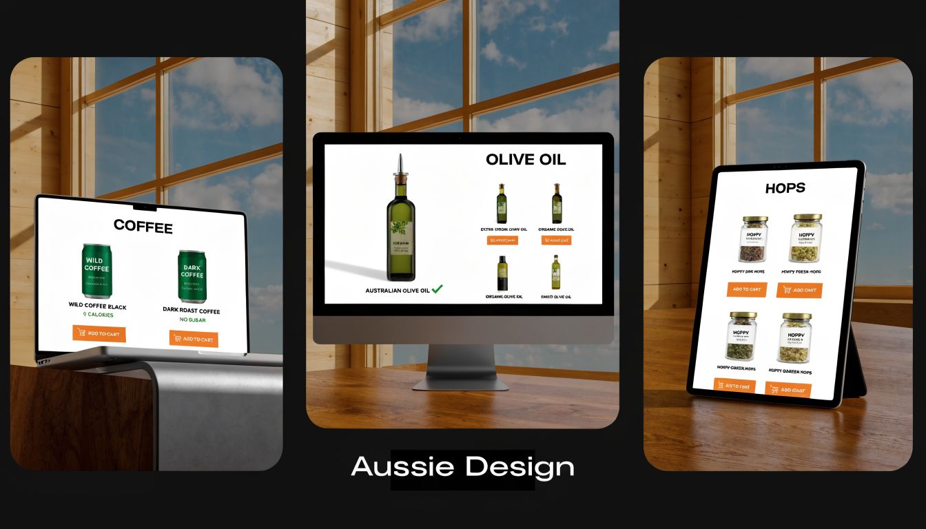
The easiest way to judge design quality is to look at how it supports real buying behaviour. Here are three fictional but realistic examples that show what good execution looks like.
A Melbourne fashion boutique
This store sells women's clothing with frequent seasonal drops. Its mobile layout is tight and clean. Category pages let shoppers filter by size, colour, fit, and occasion without cluttering the screen.
Each product page keeps the essentials near the top: images, price, available sizes, delivery guidance, and payment options. The design works because it respects how fashion customers browse. They compare, refine, and decide quickly.
A Queensland trade supplier
This business sells tools, consumables, and replacement parts to tradies and small contractors. Its homepage isn't flashy. Instead, it puts search front and centre, with category shortcuts for common product lines.
The strongest part of the site is findability. Search suggestions help users reach products fast, and filters narrow down brand, compatibility, and spec details without wasted clicks. For this audience, speed and clarity matter more than visual novelty.
A regional gourmet food brand
This store sells pantry products and gift packs across Australia. It builds trust through plain communication. Product pages show tax-inclusive pricing, delivery expectations, and local contact details clearly.
Its photography is warm and polished, but the design doesn't become heavy. Pages load quickly, checkout is short, and the site makes shipping confidence part of the buying experience. That's especially important for gift purchases, where timing matters.
These examples don't share one visual style. They share one principle. Each site is designed around how its customers shop.
Choosing Your Path An Agency or a Website Builder
Once you know what a high-performing store needs, the next decision is practical. Do you build with a DIY platform, or do you work with an agency?
Both can work. The right choice depends on complexity, time, budget, and how much control you need.
When a website builder makes sense
A builder is often suitable if your catalogue is modest, your requirements are standard, and you want to launch quickly. Platforms like Shopify, Wix, and Squarespace make it easier to get a store live without starting from scratch.
This path usually works best when:
- Your products are straightforward: Limited variants, simple shipping rules, and no unusual integrations.
- You can work within templates: You're comfortable adapting your brand to an existing structure.
- You have time to manage it: Someone in the business can handle setup, content updates, and ongoing tweaks.
For small operators comparing options, this guide to the best website builder for small business can help narrow the field.
When an agency is the better fit
An agency makes more sense when your store needs custom logic, deeper UX work, or integration with other systems such as inventory, CRMs, bookings, or customized shipping rules.
You might choose this route if:
- Your catalogue is complex
- Your checkout needs custom behaviour
- You need support with content, SEO, and performance
- You don't have internal time or technical capability
One option in that category is Website Builder Australia, which provides ecommerce builds, custom development, hosting, and ongoing site support for Australian businesses. That's useful if you need more than a theme setup and want one team handling both build and maintenance.
A quick decision checklist
Ask yourself these questions before choosing:
- Do I need custom integrations or unusual checkout requirements?
- Can I maintain the store myself after launch?
- How important is unique UX compared with speed of launch?
- Will mobile performance need careful technical work?
- Do I want a platform, or a partner?
The best choice isn't the one with the most features. It's the one that fits your store's real complexity and your team's capacity to manage it.
If you're planning a new online store or redesigning an existing one, Website Builder Australia can help you build an ecommerce site that balances design, performance, payments, and local customer trust for the Australian market.


